Clear Enrollment Message
The headline, program benefits, apply-by date, and URL were organized to move the viewer from interest to action quickly.

For this SUNY Empire Online advertisement campaign, I designed a set of digital promotional graphics focused on flexible, career-centered online learning. The goal was to create a campaign system that could quickly communicate value to busy adult learners while maintaining a polished higher-education brand presence across web, digital, and social placements.
My design process started with defining the message hierarchy: brand recognition first, the “Flexible, Career-Focused Online Learning” headline second, supporting value points third, and the apply-by date and URL as the final conversion action. I used this structure to make each advertisement easy to scan while still giving the viewer enough information to understand the benefits of the program.
I used Adobe Photoshop to build the image compositions, blend photography, adjust lighting, refine depth, and create the polished campaign look. I used Adobe Illustrator for icon work, layout structure, vector elements, shape systems, CTA treatments, QR-code placement, and clean production-ready refinements. Together, the final advertisements use strong typography, SUNY Empire-inspired blue and orange, clear information grouping, and optimistic student-centered imagery to create a campaign that feels accessible, credible, and action-oriented.
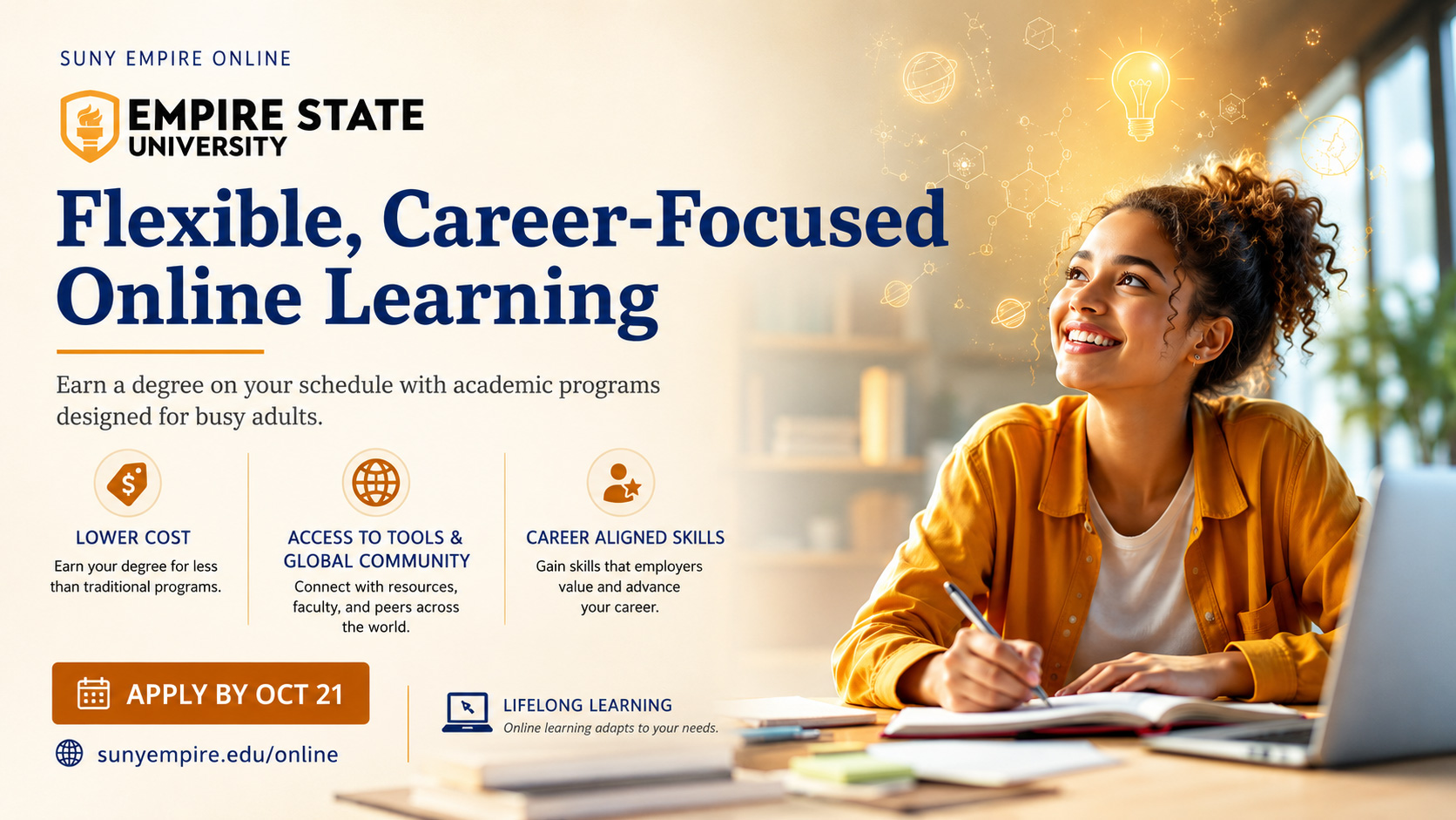
The headline, program benefits, apply-by date, and URL were organized to move the viewer from interest to action quickly.
Navy blue, orange, cream, and warm photography helped connect the ads to the SUNY Empire brand while keeping the tone energetic.
Positive learner-focused visuals helped communicate flexibility, career momentum, community, and confidence in online education.
The primary audience for this campaign was adult learners interested in online education, career advancement, lower-cost degree options, and a flexible academic path. Because this audience may be comparing programs quickly, the ad needed to communicate the value proposition clearly without feeling overloaded.
The communication goal was to make SUNY Empire Online feel flexible, credible, and career-focused. I wanted viewers to immediately understand the program promise, recognize the key benefits, and see a direct next step through the apply-by date, website URL, or QR-code option.
The creative direction centered on optimism, momentum, and accessibility. I selected bright, student-centered imagery to make online learning feel approachable and aspirational. The photography choices support the idea that students can move forward academically while still managing real-life responsibilities.
Visually, I balanced academic credibility with modern digital campaign energy. SUNY Empire’s navy blue anchors the layouts and gives the campaign authority, while orange accents create urgency around action areas such as “Apply by Oct 21,” icon treatments, arrows, QR-code emphasis, and supporting graphic elements. Cream and light neutral backgrounds help preserve readability and keep the layouts from feeling too heavy.
I treated typography as the main driver of the campaign hierarchy. The headline needed to carry the largest visual weight because it explains the campaign promise immediately: flexible, career-focused online learning. Supporting copy and benefit statements were then organized into smaller, scannable sections.
I built the advertisements as a flexible campaign system rather than a single one-off layout. Each version uses the same core message, brand colors, and call-to-action structure, but the layout shifts depending on the communication need and available space.
The final campaign created a polished visual system that presents SUNY Empire Online as flexible, accessible, and career-driven. Each advertisement communicates the same core message while offering a different visual approach for audience engagement, benefit explanation, or direct-response action.
From a design standpoint, the value is in how the campaign balances emotional appeal with practical information. The visuals create optimism and energy, while the hierarchy, icons, CTA treatments, and structured content modules help viewers understand the offer quickly and know what to do next.
These advertisement variations show how the campaign system adapts across different compositions while keeping the core message, brand color, visual hierarchy, and call to action consistent.